Voyan

Voyan

Bespoke travel experiences

Tailor-made travel experiences that are easy to track, follow and book through a streamlined progressive web app experience.

Years

2022-2023

Client

PWN TEK
Custom trips require custom solutions

To kick things off, we benchmarked a multiple apps that offered travel products, concierge-like experiences, and custom-made trips. Since one of the unique value propositions from Voyan was booking and not having to worry about the trip other than having a great time, we wanted to focus on having all the dates of your trip easily accessible on the main page or view. With our benchmark, we focused on analyzing what sort of data points other products were giving their users and if they made sense in our product. Since our focus was more on a hands-off experience where an expert created the trip for you, we compared it to products like travel planners or apps like Google Maps that provide more recommendations rather than explicitly defined activities for users to follow.

The problems we wanted to solve for users:

• Information of the city or cities they would be visiting, since they handed off planning to Voyan, some basic info to get them up and running, emergency contacts, general recommendations would be well received for a traveler.

• Clear information of each activity.

• Location for each activity and a map view so they wouldn't need to copy and paste an address to google maps for each destination or activity.

• An ordered list of daily activities and trip duration or calendar view.

First leg of the trip

For the first iteration, a user would be an introduced to the city they were visiting, with basic information about the local culture, getting around, emergency links, and important information about the city.

Next, you would have the dates of your trip, which you could click on to see the activities planned for that specific date or scroll through them to see a little bit of information about each one, such as the recommended time, address and operating hours, reservation links when needed, and their website. You would also have a map of the city you'd be visiting, with markers for each activity color-coded by day.

Next, you would have the dates of your trip, which you could click on to see the activities planned for that specific date or scroll through them to see a little bit of information about each one, such as the recommended time, address and operating hours, reservation links when needed, and their website. You would also have a map of the city you'd be visiting, with markers for each activity color-coded by day.

Next, you would have the dates of your trip, which you could click on to see the activities planned for that specific date or scroll through them to see a little bit of information about each one, such as the recommended time, address and operating hours, reservation links when needed, and their website. You would also have a map of the city you'd be visiting, with markers for each activity color-coded by day.

Finally, we thought of having both a left-hand menu with city and trip information and a top menu with a date picker option to export, in case you might be worried about cellular service or roaming rates. Additionally, there would be a button to invite other users to this trip and a profile button.

Finally, we thought of having both a left-hand menu with city and trip information and a top menu with a date picker option to export, in case you might be worried about cellular service or roaming rates. Additionally, there would be a button to invite other users to this trip and a profile button.

Finally, we thought of having both a left-hand menu with city and trip information and a top menu with a date picker option to export, in case you might be worried about cellular service or roaming rates. Additionally, there would be a button to invite other users to this trip and a profile button.

feedback

After having moderated testing sessions with 6 users we came back with the following findings and challenges:

  • What would happen with a 20-day or even longer trip?

  • What would a multi-city trip look like?

  • Could users edit the trip that was designed for them if something is closed or if they want to make changes?

  • Could users expand a specific view, such as focusing on only the list view or the map view instead of having a split screen?

  • What happens if a user wants to change dates?

Implementing changes

In the second iteration, we took all the previous questions and comments into account and updated the user experience.

We added date pickers showing explicitly the dates for each city in the top menu bar, as well as having each city listed in the left-hand panel. Unless requested by a user, if they changed dates but the total number of days remained the same, we would keep the same activities and just move them to the new days.

We added date pickers showing explicitly the dates for each city in the top menu bar, as well as having each city listed in the left-hand panel. Unless requested by a user, if they changed dates but the total number of days remained the same, we would keep the same activities and just move them to the new days.

We added date pickers showing explicitly the dates for each city in the top menu bar, as well as having each city listed in the left-hand panel. Unless requested by a user, if they changed dates but the total number of days remained the same, we would keep the same activities and just move them to the new days.

We added a hover state that showed a draggable icon on each activity card, as well as a checkbox in case users wanted to move, delete, or adjust multiple activities at once. We also changed the background color of the header menu and updated some buttons to provide more feedback when users selected activities, letting them know what actions they could take upon selecting them.

We added a hover state that showed a draggable icon on each activity card, as well as a checkbox in case users wanted to move, delete, or adjust multiple activities at once. We also changed the background color of the header menu and updated some buttons to provide more feedback when users selected activities, letting them know what actions they could take upon selecting them.

We added a hover state that showed a draggable icon on each activity card, as well as a checkbox in case users wanted to move, delete, or adjust multiple activities at once. We also changed the background color of the header menu and updated some buttons to provide more feedback when users selected activities, letting them know what actions they could take upon selecting them.

The expanded views for the activities panel and the map view, taking cues from Google Maps offer a clean user interface while still showing a focused activity when selected. We also made it easy to navigate between the next and previous activities. To complement these screens we made a compact variation of the left hand panel.

The expanded views for the activities panel and the map view, taking cues from Google Maps offer a clean user interface while still showing a focused activity when selected. We also made it easy to navigate between the next and previous activities. To complement these screens we made a compact variation of the left hand panel.

The expanded views for the activities panel and the map view, taking cues from Google Maps offer a clean user interface while still showing a focused activity when selected. We also made it easy to navigate between the next and previous activities. To complement these screens we made a compact variation of the left hand panel.

Taking the trip with you

Taking the trip with you

Taking the trip with you

At this point, we moved on to designing a mobile version of the main features of the app. After careful deliberation, it was decided that we would work on a progressive web app instead of a native app to avoid forcing users to download anything and to simplify the development for this first version of the product, if all goes well we hope to collaborate with the PWNTEK's team on native apps, but pragmatism is key to be fast and get feedback to make a product that users will love to use. To further reduce development resources we worked with Chakra Ui's design system, a tried and true solution for desktop and mobile that is easily deployable to any dev environment.

At this point, we moved on to designing a mobile version of the main features of the app. After careful deliberation, it was decided that we would work on a progressive web app instead of a native app to avoid forcing users to download anything and to simplify the development for this first version of the product, if all goes well we hope to collaborate with the PWNTEK's team on native apps, but pragmatism is key to be fast and get feedback to make a product that users will love to use. To further reduce development resources we worked with Chakra Ui's design system, a tried and true solution for desktop and mobile that is easily deployable to any dev environment.

At this point, we moved on to designing a mobile version of the main features of the app. After careful deliberation, it was decided that we would work on a progressive web app instead of a native app to avoid forcing users to download anything and to simplify the development for this first version of the product, if all goes well we hope to collaborate with the PWNTEK's team on native apps, but pragmatism is key to be fast and get feedback to make a product that users will love to use. To further reduce development resources we worked with Chakra Ui's design system, a tried and true solution for desktop and mobile that is easily deployable to any dev environment.

On the main screen of the mobile app, users would have access to their profile and support, as well as seeing their trips.

On the main screen of the mobile app, users would have access to their profile and support, as well as seeing their trips.

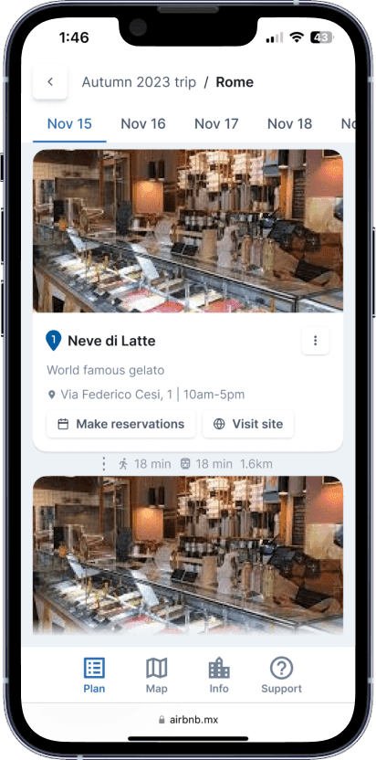
Upon clicking on a trip with multiple cities in the itinerary, users would see the cities in chronological order and be able to tap on any city to view its activities. In the trip view, there would be a scrollable date picker that automatically changed cities upon moving to any date of another city, activity cards per day, and a lower menu dividing city plan, map, info, and support for the trip.


Upon clicking on a trip with multiple cities in the itinerary, users would see the cities in chronological order and be able to tap on any city to view its activities. In the trip view, there would be a scrollable date picker that automatically changed cities upon moving to any date of another city, activity cards per day, and a lower menu dividing city plan, map, info, and support for the trip.

In the map view, users would be able to see, as on the desktop breakpoint, the activities color-coded by day, along with a layers menu offering options to toggle specific dates, walking routes, and public transport routes to the next destination.

In the map view, users would be able to see, as on the desktop breakpoint, the activities color-coded by day, along with a layers menu offering options to toggle specific dates, walking routes, and public transport routes to the next destination.


Tapping on the city info would anchor the quick links at the top, replacing the dates and in the support section, users would quickly find specific or common questions on the platform, such as payment, local help, legal information, and more.


Tapping on the city info would anchor the quick links at the top, replacing the dates and in the support section, users would quickly find specific or common questions on the platform, such as payment, local help, legal information, and more.

Unifying both experiences

To finish this iteration, we unified some new ideas that came up as we designed the mobile user experience, and updating the components to Chakra UI's throughout the interface.

To finish this iteration, we unified some new ideas that came up as we designed the mobile user experience, and updating the components to Chakra UI's throughout the interface.

To finish this iteration, we unified some new ideas that came up as we designed the mobile user experience, and updating the components to Chakra UI's throughout the interface.

Next Steps

Next Steps

Next Steps

We're very excited to receive user feedback and work on future iterations with Voyan's team, helping them fulfill their vision and business goals for this venture through great product design, customer experience, and providing a specific concierge-like service in the digital era.

We're very excited to receive user feedback and work on future iterations with Voyan's team, helping them fulfill their vision and business goals for this venture through great product design, customer experience, and providing a specific concierge-like service in the digital era.

We're very excited to receive user feedback and work on future iterations with Voyan's team, helping them fulfill their vision and business goals for this venture through great product design, customer experience, and providing a specific concierge-like service in the digital era.

Choose the best plan for your needs

Pricing

Pricing

Pricing

& plans

& plans

& plans

Unlimited design for a fixed monthly price

Subscription

$3500/mo

• Product Strategy
• Ui/UX
• Visual Design
• PDP design
• Amazon A++ Creatives
• Amazon Storefront Creatives
• Motion graphics
• And more

Include web development

Hourly

$65/hr

Get to know our quality, services and make sure we're a good fit.

Subscription

$3500/mo

• Product Strategy
• Ui/UX
• Visual Design
• PDP design
• Amazon A++ Creatives
• Amazon Storefront Creatives
• Motion graphics
• And more

Include web development

Hourly

$65/hr

Get to know our quality, services and make sure we're a good fit.

Subscription

$3500/mo

• Product Strategy
• Ui/UX
• Visual Design
• PDP design
• Amazon A++ Creatives
• Amazon Storefront Creatives
• Motion graphics
• And more

Include web development

Hourly

$65/hr

Get to know our quality, services and make sure we're a good fit.